Sunday, 30 September 2012
3D Design - Theory
Zellwegger aims to generate debate on new directions of social ritual, and the relationship between design and science. By using industrail materials which have become close to the current ways of life, and reverts them into interesting pieces which creates curiosity: What classes jewllery? When can jewelllery become a weapon? What makes a piece valueable?
Thomas Heatherwick, a designer I have begun to follow in recent weeks since the revealing of his recent design of the Olympic cauldren, I have found his sculptures such as 'B of the Bang' and the 'Roll-up Bridge' in London.
The 'B of the Bang' was commitioned as a gift for the Manchester Games in 2002 and formed to be the tallest structural piece in the UK and also, the sculptureal beam leaned at an angle great er than the Leaning Tower of Pisa. This particuliar pieces of Hetaherwick si made up of 180 beams balanced on five 25m long columns of the same material, none of the structure glue or fixed in to place as the sculpture also moved with the energy in the wind so as to reflect the natural energy of the Games.
Constructed in Sheffield, Heatherwick aimed the design to with stand 100 mp winds but, unforunately, failed as several 'spike' columns had fallen and almsot impailed street walkers.
Fine Art
In my second week, focusing on the areas within Fine Art, I explored the formal/basic properties of objects that interested me (such as the everyday objects and industrail products or the combination of the organic and the synthetic), concerntrating on their outlines, distorted forms and basic shapes. By doing this I could generate and develop an idea and concerntrate more on the importance of balancing colours.
Here I created a block form combination using plywood triangles, cups, string and bottle caps whilst balancing two strong complimentary colours (blue and orange) on a pale background.
Here I followed the same theme of block, bold colours so interprate the synthetic arrangement of string.
With this piece, I wanted to create some thing fun and child like style that would follow an almost illustrative design, using primary colours and one secondary. Whilst doing so I used the technique of a stabbing motion which an infant might do with poster paints but in a deliberate fashion so as to interprate the intracate design.
On the second day of experimantation, I was able to use the projector which allowed me to experiment with shadows, merging organic objects and the synthetic materials which allowed me to create the illussion of a giant octopus comically gobbling away a human illustrated by the shadow of my own hand trying to reach out for the life buoy.
Here again I flollowed the same illustrative illussion with shades much like the first projection piece but this time with a different animal (reptile/chamelian/lizard).
Here I created a block form combination using plywood triangles, cups, string and bottle caps whilst balancing two strong complimentary colours (blue and orange) on a pale background.
Here I followed the same theme of block, bold colours so interprate the synthetic arrangement of string.
With this piece, I wanted to create some thing fun and child like style that would follow an almost illustrative design, using primary colours and one secondary. Whilst doing so I used the technique of a stabbing motion which an infant might do with poster paints but in a deliberate fashion so as to interprate the intracate design.
On the second day of experimantation, I was able to use the projector which allowed me to experiment with shadows, merging organic objects and the synthetic materials which allowed me to create the illussion of a giant octopus comically gobbling away a human illustrated by the shadow of my own hand trying to reach out for the life buoy.
Experimentation with texture, printing with objects and compositions synthetic materials such as scrunched up paper (creating flowery textures similiar to rose buds, inteprating the them of naturalism with unorganic material), plastic film tape and strings.
Here again I flollowed the same illustrative illussion with shades much like the first projection piece but this time with a different animal (reptile/chamelian/lizard).
Monday, 17 September 2012
3D Design - 2D Indian Ink and 3D models
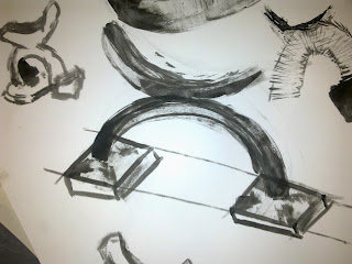
Here are a collection of 2D and 3D Designs I whipped up during my first week of 3D Design, where I experimented with Indian inks and cardboard strips (instead of a fountain pen or paint brush), line drawings and craft knives so as to challenge me as the medium was far from what I was used to. I did try hard to incorparate an illustrative and graphic style into each piece.
Friday, 14 September 2012
Endora - Illustration
Many people will be familiar with the 60/70's American TV series, 'Bewitched' so should be well acquainted with Endora, whom which I based my design around.
Firstly, I began the drawing with a Fine Liner pen and played around with witch like eyes (or cat flicks) which was Endora's trademark to her charactor, as well as vivid green eyes, blue eye shadow and vivid orange hair. I also experimented with backgorunds designs so as to make to overall picture/ final piece have more impact and professional appearance.
Then, with a quick refining, rendering and artistic arrangement of background patterns (flowers), 'Endora' was complete.
Thursday, 13 September 2012
Line drawing - 3D Design
After life and line drawing class in 3D Design I left wanting to more and to improve but I didn't want to interpret lines designs of small scale items so I decided to try buildings. I chose Town Hall, Sheffield, as my subject matter. No shading, just lines so as to highlight the basic structures and architectural design.
Top: Green fine line
Middle: Coffee Pot with 2B Graphite
Bottom: Coffee Pot with Graphite. Experimenting with lines creating texture.
Top: Green fine line
Middle: Coffee Pot with 2B Graphite
Bottom: Coffee Pot with Graphite. Experimenting with lines creating texture.
Tuesday, 11 September 2012
Boat and Harbour Illustration - St Ives
This is an Lino Cut Print left I'd scanned to develop and experiment further on Photoshop. I kept the colour at a minimal standard so as to avoid taking away the impact of the bold and striking print (with Black Ink). The design is a representation of St Ives, I place I visit often and is the home of St Ives Tate which also exhibit's their own range of interesting prints such as mono prints of the calm Western Coast and the busy industrial movement. In my piece I wanted to combine the busy holiday, sea side resort hustle and bustle with the calm harbour.
Subscribe to:
Posts (Atom)